
In one of our previous articles, we discussed Multiple Time Frame Analysis and its benefits. This approach involves starting with higher timeframes, such as the Daily Chart Analysis, and then moving down to intraday trading timeframe charts like the 15-min, 10-min, or 5-min.
In this article, we’ll focus on Daily Chart Analysis in more detail. Among all higher timeframes, the daily chart is my favourite for identifying market structure and understanding the overall market context.
What are Daily Charts?
Daily charts are trading charts where each candlestick or bar represents one full trading day of price action. They display the open, high, low, and close (OHLC) for that day, capturing the market’s activity over a 24-hour period (or a standard market session, depending on the asset).
Let’s take a look at the Aug’25 Nifty Future Daily Chart below: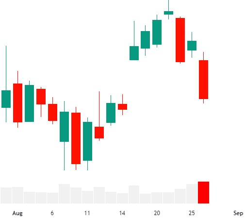
Before we dive into how to analyze daily charts, let’s first understand why daily chart analysis is important.
Why Are Daily Charts Important?
Daily charts encompass far more market activity and trading volume than 5, 10, or 15-minute charts. This means that when a daily pattern forms, it is backed by much more market participation and transactions compared to smaller timeframes.
If there’s one rule to remember: Daily bars are more significant than intraday bars.
Here’s why: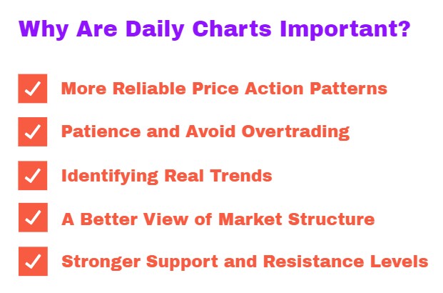
- More Reliable Price Action Patterns
Price action is the foundation of trading. While many new traders assume lower timeframes offer more opportunities, they often end up trapped by false signals. Patterns, levels, and setups are far more reliable on daily charts, where market intent is clearer and trends smoother.
- Patience and Avoiding Overtrading
Intraday charts tempt traders into overtrading and jumping into positions when no real opportunity exists. This often stems from the urge to stay active or micromanage trades. The daily chart helps break this cycle. Since each bar takes longer to form, you only need to analyze the market once a day either at the close or before the next session opens.
- Identifying Real Trends
In trading, success often comes from following the path of least resistance and the prevailing market trend. Daily charts allow you to spot these sustainable trends far more clearly than intraday charts. This gives you a stronger sense of where the market is really heading and helps you avoid getting misled by intraday noise.
- A Better View of Market Structure
Daily timeframes provide a wide-angle view of price action. Unlike intraday charts that limit historical perspective, daily charts show short-, medium-, and long-term trends, helping traders align with the broader market cycle.
- Stronger Support and Resistance Levels
S/R levels drawn from daily charts are far more significant than those from intraday charts. Why? Because more traders including institutions watch daily levels than any other timeframe. Even day traders monitor these levels for guidance. This means daily S/R zones usually hold more order flow and are respected more often.
How to analyze a daily charts?
The daily chart is one of the most powerful tools for pre-market analysis and multiple timeframe analysis because it reveals the bigger picture of market structure. Before every trading session, I always begin with the daily chart to understand where the market stands and to identify key levels that may influence intraday setups.
Unlike lower timeframes, which can get noisy, the daily chart gives you clarity on structure, momentum, and context. This allows you to align your intraday decisions with the broader market narrative, improving both accuracy and confidence.
Key Questions to Ask Yourself during Daily Chart Analysis
When analyzing the daily chart, review the last few weeks of price action and try to answer the following:
-
- What are the key swing points that define HTF support and resistance?
- Are there gaps or psychological levels that may attract price?
- Is the market trending or ranging?
- What is the current market structure?
- Where is the market opening relative to the previous day’s range (PDR)?
By asking these 5 questions every morning on the daily chart, you set up a clear directional bias and key levels before drilling down into your intraday trading timeframe for actual setup identification.
In this article, we will focus on the first three questions, as they are essential for understanding the macro market structure and the broader framework within which all intraday price action takes place. The last two questions relate more directly to how the daily chart interacts with trading timeframes, which we will cover in upcoming articles
Identify Macro Market Structure with Daily Chart Analysis
- Swing Highs and Lows
-
- Mark the key swing highs and lows on the daily chart.
- These serve as important support and resistance levels where the market has previously reacted.
- Gap High
-
- Identify the Gap High as a higher timeframe resistance in a downtrend.
- Watch for price reactions when the market approaches these levels.
- Gap Low
-
- Identify the Gap Low as a higher timeframe support in an uptrend.
- These levels often act as demand zones where buyers step in.
- Psychological Round Number
-
- Round numbers (e.g., 18000, 19000) are natural magnets for price.
- Market participants often set their buy/sell orders around these levels.
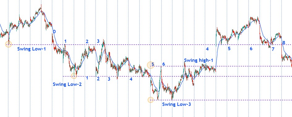
Daily Chart Analysis Example
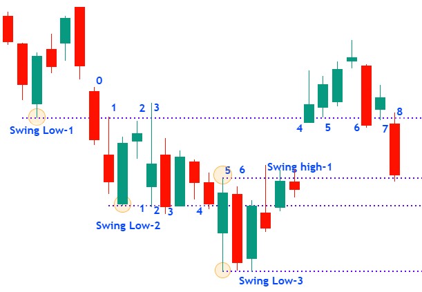
In the above chart, three swing lows and one swing high are marked using above daily chart analysis method. Let’s discuss each swing in detail
Swing Low-1:
The swing low-1 was created at the candle marked with a circle. When extended forward, this swing low acted as support for the following days. The market stayed above this level for a while, but eventually, it was broken by the candle marked as candle-0, after which price remained below it—turning that support into resistance for the coming sessions.
Looking at candles 2 and 3, the same swing low clearly acted as resistance, keeping the market capped below it. Later, on candle-4, the market opened with a gap up and retested swing low-1, this time finding support. Over the next few candles (5, 6, and 7), the level continued to act as support.
However, on candle-8, the swing low was broken again with a gap down, and price stayed below it. This confirms that for the upcoming days, the same swing low will once again act as resistance.
Swing Low-2:
Swing low-2 was created at the candle marked with a circle. This level acted as support for the following days, which is clearly visible at candles 1, 2, 3, and 4. However, at candle-5, the swing low was broken, suggesting it could turn into resistance for the upcoming days.
Interestingly, on candle-6, the price moved straight through this level without reacting, indicating that this swing low is no longer significant. The following candles also confirmed that it did not act as either support or resistance in the days ahead.
Follwed by the same price action behavior can also be observed on Swing Low-3 and Swing High-1 in the chart above.
So far, we have identified the market structure on the daily chart. Now, let’s move down to the trading timeframe and observe how these daily support and resistance levels (discussed above) play out in real-time price action.
You see how daily chart analysis provides a clear framework and defines the boundaries of price movement at trading timeframe. It anchors your Trend Bias and highlights key Decision Making Zones, enabling you to spot and execute setups on lower timeframes that align with the broader Market Structure.
Think of the daily chart as the map and your trading timeframe as the compass. Without the map, the compass leads nowhere.
Identify Micro Market Structure with Daily Chart Analysis
When you open a daily chart and look closely, the first question is: What do you really see?
Most traders immediately focus on candlestick pattern: bullish or bearish engulfing, Doji, Hammer, Shooting Star, Hanging Man or Inverted Hammer etc. While that’s useful, I prefer to look at the daily chart through a different lens.
Instead of memorizing dozens of patterns, I simplify the whole chart into just two types of candles, no matter the timeframe:
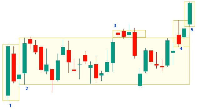
- In-Range Candles
-
- A candle that stays within the range of a previous candle.
- In- range candles also known as Inside candles (will discuss in following articles).
- They represent consolidation, a pause in price movement, or market indecision.
- Inside candles often signal that the market is building up pressure before a breakout.
- Not In-Range Candles
-
- A candle that breaks outside the previous candle’s range. Or a candle that is not within the range of previous candle.
- I named Not In- range candles as Lone Wolf Candles .
- They represent expansion, momentum, or aggression in price movement.
- Lone Wolf candles show when the market is stepping out of balance and creating new structure.
Let’s explore this price action with the example above:
Candles marked 1, 2, 3, 4, and 5 are Lone Wolf candles, which are not in-range candles. Each of these Lone Wolf candles is followed by in-range (inside) candles that remain within the range of the previous Lone Wolf candle. Do you notice any exceptions? Not a single candle in this chart falls outside this structure.”
By training your eyes to classify candles into Inside Candles and Lone Wolf Candles, you strip away the noise and start seeing market structure more clearly.
If the Previous Day Candle is an Inside Candle
When the previous day forms an Inside Candle, it means price remained completely within the range of the prior candle. This indicates consolidation, balance, or indecision in the market. However, not all Inside Candles are the same by looking more closely, we can further classify them into three distinct types:
- Single Inside Day Candle
- Multiple Inside Day Candle
- Inside Day within a Two-Day Candle
If the Previous Day is a Lone Wolf Candle
When the previous day forms a Lone Wolf Candle, it means price has broken outside the range of the prior day. This signals initiative activity, expansion, or directional intent in the market. Lone Wolf Candles can be further classified into three types:
- Trend Day (Bull or Bear Day)
- Narrow Range Day
- Typical Range Day
How to Use Inside and Lone Wolf Candles
Now that you can identify whether the previous day’s candle was an Inside Candle or a Lone Wolf Candle, the real question is: How do you actually use this information in your trading?
This is where your Trading Time Frame (TTF) Analysis comes into play. The daily chart provides you with the market context & high risk reward trade entry zones, but the decision making and setup identification must come from analyzing price action within your chosen TTF.
How I Use This Classification (Brief Overview)
| Daily Chart Analysis | |
| Identify Macro Market Structure | |
| 1 | Mark Gap High as HTF Resistance for downtrend, if any. |
| 2 | Mark Gap Low as HTF Support for uptrend, if any. |
| 3 | Mark high & low of Mother Candle with multiple Inside Candles |
| Identify Micro Market Structure | |
| 4 | Type of Previous Day Candle (Alpha/Inside/Range Candle)? |
| 5 | If PD is an Alpha Candle then its type? |
| 1. Trend Day (Bull or Bear Day) | |
| 2. Narrow Range Day | |
| 3. Typical Range Day | |
| 4. Range Day | |
| 6 | Is PD an (single) Inside Candle? |
| 7 | Is PD a Range Candle then identify the Current Phase of Market Structure? |
| 1. Test of Structure | |
| 2. Continuation of the Current Swing | |
| 3. Breakout of Structure | |
| 4. Breakout Failure of Structure | |
| 5. Breakout & Pullback from Structure | |
| 8 | Visualize the Potential Trend of the Day based on Market Structure |
This is the bigger picture view and checklist used by me for daily chart analysis during pre-market analyis. In the upcoming articles, we will break down each point with detailed rules, real-market examples, and practical applications. Stay tuned.